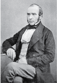
The cholera map
that changed the world
 John Snow's map of cholera outbreaks from nineteenth century London changed how we saw a disease and is
considered as one of the most inspirational examples of data journalism.
In the world of the 1850s, cholera was believed to be spread by miasma in the air and the sudden and serious
outbreak of cholera in London's Soho was a mystery.
His map essentially represented each death as a bar as you can see in his map on the right. It became apparent
that the cases were clustered around the pump in Broad (now Broadwick) street, which was polluted by sewage from
a nearby cesspit.
As a fun experiment, we decided to visualize the same data in 3D. Our 3D version uprights the original stacks of death, creating a vertical stack in the third dimension. This helps us visualize where the deaths occurred at their correct geographic location, which is important when gauging distances to the closest water pumps. Also on a 2D map, the stacks could overlap or extend off the streets or other features of the map. They are aligned with each street, so opposite sides or perpendicular streets make a direct comparison difficult.
Originally John Snow aggregated into areas all the deaths on his map which were closest to each pump. We generated such Voronoi diagrams and displayed on the map.
The section of Snow's map representing areas in the city where the closest available source of water was the Broad Street pump included the highest incidence of cholera cases. Click on the stacked death incidents to see which is the closest pump.